So my vision for the dashboard is something of a page, from where you'd be able to handle the most basic stuff without the need of menus.
A full-fledged control board if you will.
A step towards that could be a small one, say we talk about your currencies.
Now, to know how much of some currencies you hold is an important info, hence your own currency and vbx is already displayed.
Instead of simply displaying these two, give the possibility to select say 4-5 currencies to display in the player's card.
With a small + icon, when you click it a popup comes up with all the currencies, and from there you could select any from 0 to 5.

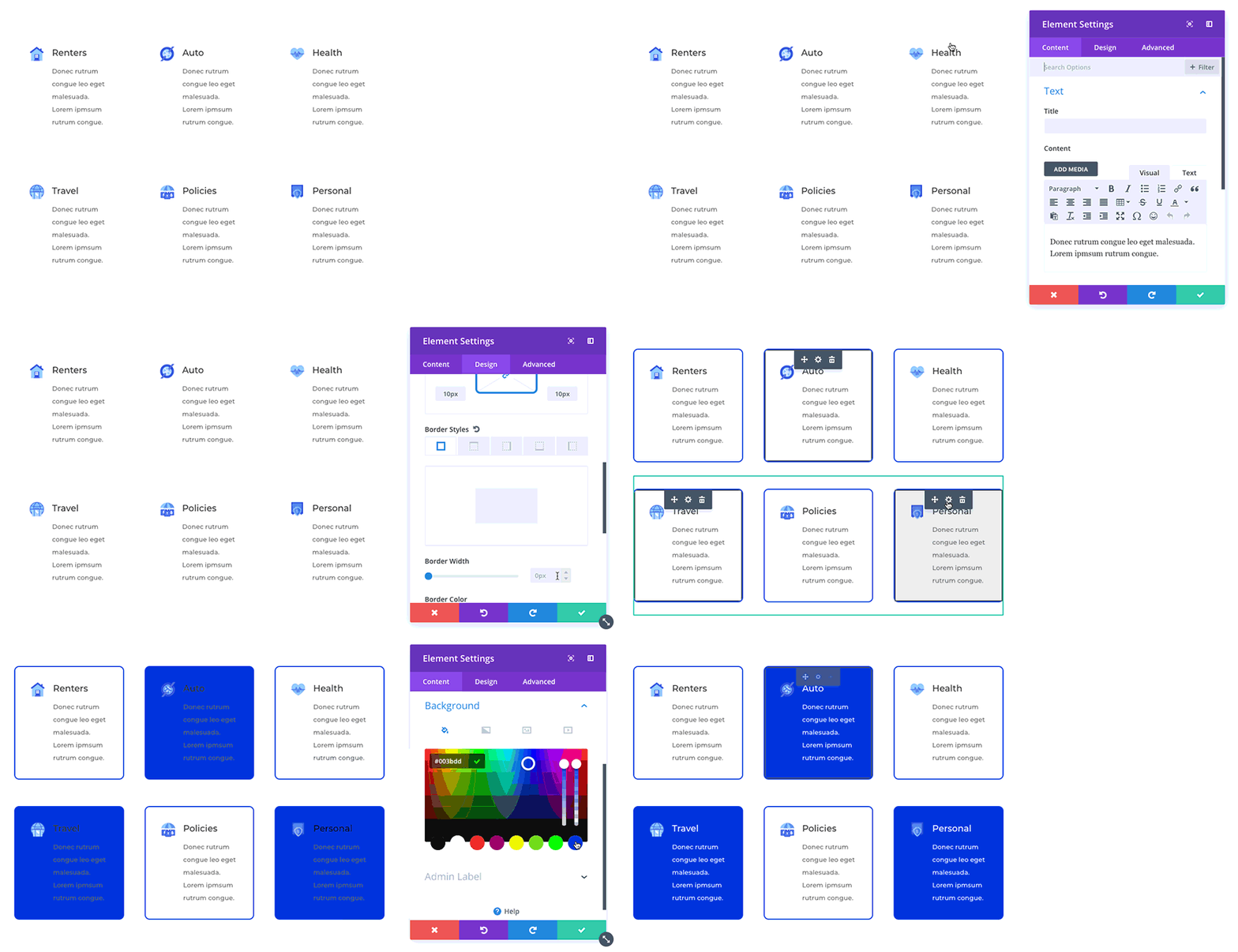
for selecting the currencies I'm thinking something like in the gif, you click the items and it becomes selected with an effect (border in this case but it could be anything, like background color etc.)

Report Suggestion


Recommended Comments
There are no comments to display.
Create an account or sign in to comment
You need to be a member in order to leave a comment
Create an account
Sign up for a new account in our community. It's easy!
Register a new accountSign in
Already have an account? Sign in here.
Sign In Now